Feeds:
Posts
Comments

Hello! Welcome to my NM2208 online portfolio!

NM2208 (Principles of Visual Communication) is a module offered under the Faculty of Arts, Communications and New Media department in the National University of Singapore.

Here, you will find all individual assignments and class exercises that I have completed, the critique that I received from my classmates and lecturer, and the improvements made and lessons learnt through the module. There is also a final group project in which we are required to come up with a children’s storybook.

All you have to do is use the categories at the right to navigate through the assignments!


I hope you enjoy your stay here!

Class Exercise 5

Okay so here is class excercise E on form

I paired up with another girl from another tutorial group so we each chose one letter from each group.

This is clutter:

We did it such that everything is all over the place, which represents clutter pretty well in my opinion.

And this is Order, represented by lines of equal length, width, colour, each with equal spacing in between each other.

So I redone the pictogram assignment because I had really wanted to do this before the semester officially started, but after reading the assignment brief, I misinterpreted it as if we need to do a pictogram of a place… So here goes!

Ever boarded the bus, seeing many seats, and wanting on sit on one, only to find out that all the seats are inner seats and all the seats have people sitting on the outer seats? Oh no, that means you have to squeeze, push, crouch, jump, whatever, just to get to the inner seat! Best of all, your stop is not even that far away. You might as well just stand as it is more convenient.

Well, that’s what I always experience. Especially for the feeder bus to my home. Therefore, I have made this pictogram!

If I could insert text, I would put “Please occupy all the inner seats first before filling up the outer seats”.

I know I am making a huge fuss out of the seats thing, but an assignment is to be done so how? Haha.

P.S. I don’t really mind la. HAHA. I’m not so 小气 one okay.

Assignment 4

Assignment 4: Color Coalition

The theme is youth. A rather vague and wide theme, don’t you think?

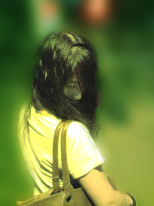
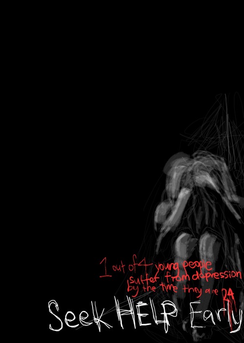
Anyway, I chose to deal with Youth Depression. 1 out of 4 youth suffer from depression by the time they reach 24! That’s an incredible statistic, isn’t it?

Front:

Back:

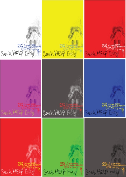
Color Coalition:

My idea is to create an empty-looking feel with the characters and letters all cramped into one corner such that one is able to feel the discomfort and emptiness, and hopefully some despair that people suffering from depression often feel.

A variety of colours were tried out but ultimately, the black with the red letterings still fits the concept best.

After tutorial:

They also feel that the black with the red fits best. Someone also commented that the other colours feel way too bright for something as dark as depression. I also learnt something about stereotypes. Why did it naturally occur to me to use a female figure? Hm. Food for thought! Also, aishah pointed out that when she first looked at the postcard she thought it had something to do with pregnancy/abortion because it was a female figure in the picture. Others also pointed out that the white letterings should also be cramped towards the right so that it fits more into my idea of cramping everything into one corner. Oh yeah, I know this is called FORM. Too bad my vocab is not very good, don’t really know how to put this word into my explaination. Oh Oh and someone said that 25% is not a very good figure, maybe 1 out of 4 is better.

Thus, collating all the above feedback, is my final product!

Another thing to add on, which is totally random, but I really liked Yuezhi’s and Tammy’s postcard designs.

Final Project

It was fun doing the Final Project. First was coming up with the storyline. Then was coming up with the rhymes. A lot of time was spent drawing and drawing and drawing, and a lot of what we drew had to be put aside because cannot use.

We spent a day at Page One to source for ideas and drawing styles, a few days here and there brainstorming, two to three sessions sketching, and many nights developing the final prototype. In short, it was hellllllll. I cannot imagine the amount of time we have spent on this project… I have NEVER worked this hard for any project in the whole of my life! But, I have also never felt such great satisfaction in my whole life either! I am so glad to be able to work on this with the 4 greatest people in the world!

Some problems encountered…

Everyone had different drawing styles and the pictures do not appear coherent. So we had to do quite a lot of redrawing. We assigned a few to draw and a few to colour, but of course these roles dissolved and in the end we’re all doing some here and some there but it was fun to be involved in the different types of production.

Here are some pictures

Assignment 5

Infographics Assignment

Article:

http://www2.timesdispatch.com/rtd/lifestyles/health_med_fit/article/I-OXYG0305_20100408-224502/336104/

Picture references:

All the giant squid photos I found on the net were ultra gross so I decided to refer to an illustration instead 😛

Design Process:

This is the initial draft, but peers commented that it looked more like a blackhole in outer space than a sea. Thus, I played around with the colours because I initially thought that the problem was with the colours.

Then someone pointed out that it wasn’t really just the colours. So I played around with gradients and feathers.

And finally decided with the feathered version.

What I have learnt from doing this assignment: Illustrator can kill you, but if you use photoshop it might kill you even faster.

And after doing this assignment I have learnt to appreciate Infographics more.

My favourite Japanese boyband has just released a new single titled “Troublemaker”! And finally, I got to see the full PV (Promotional Video – aka MV). I really like the concept of the PV, though I’d say otherwise about their stylists’ tastes. The PV is mostly stop-motion, which turned out really cool.

And just nice, there was discussion going on about stop-motion animation and stuff during our last tutorial, and Witono has posted them up on the forum.

So I decided that I might as well just put their PV up on my blog too 😀

I love the new song! But it’s not something that most people will like. Haha, who cares.

Some photos

Just sharing some photos from my recent outing with my friends at West Coast Park. A simple celebration of one of my friend’s 21st birthday.

And surprise! I found out that the Fibonacci thingy also works here!

So cool!

Assignment 3

This is the photo assignment which I have been looking forward to for very long!
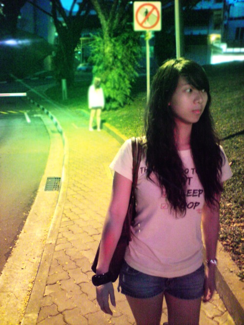
How is it how is it? Can you tell what my story is about? I showed it to a lot of people and most of them could tell. But of course, there still exists people who don’t quite get it, so I’m a bit worried here.

In case you don’t really get it, a girl on the way home gets tapped on the shoulder by an eerie ghost. Luckily, the ghost turned out to just be a prankster, who laughs heartily at the girl for being scared by her. However, what the prankster does not know is, the girl she has just pranked on is the real ghost…

And yeah, this assignment is super heavily photoshopped. And I took the photos at around 7+pm so the lighting was horrible and so the noise also increased because I had to use high ISO. And I used my phone camera (5MP) because I don’t own a decent (working) camera.

The main aim of this assignment is to let us appreciate camera angles, as well as proportions via Fibonacci spiral, Rule of Thirds (the lazy man’s cheat for Fibonacci spiral), etc. I think the Golden proportion theory taught in lecture was super interesting. Isn’t it amazing how the Golden proportion can actually be found everywhere? 😀

First of all, let’s explore the camera angles used in this work.

1. it looks like a mid shot for the subject in front, but the main subject is actually the one behind, which is shot with a long shot. there’s also a reddish and greenish tint from photos 1 to 3

2. it’s a mid shot, and slanted, because it gives a uncomfortable feeling, which is also what was mentioned during lecture

3. slightly slanted medium close up. Ok, I just checked the lecture notes that it’s called Dutch (canted angle).

4. mid shot, kind of eye-level, and also, the colour tint is not so strong. in fact, I didn’t do any colour adjustments to this photo. the point of it is that I want to viewer to feel that this photo is one that is comfortable as compared to the first 3 photoes, like returning to reality after a nightmare. also, this is an attempt to reconstruct the “over the shoulder” shot taught in lecture.

5. same as photo 4

6. considered long shot since we can see the whole body of the running girl. also an over the shoulder shot.

7. medium close up. I had intended it to be a close-up, but found out that my photo resoultion was too low for me to crop it and yet make it look crisp enough. sighs. also, the colour tint is back! And this time it is in full throttle! To make all you viewers uncomfortable, scared, queasy, etc. With a basic colour tint, everyone can tell that it is a ghost. How powerful colours are. I initially thought that I may have to photoshop the whole face of my friend, add blood streaks, blah. But looks like colour is enough to communicate my idea across. I’m amazed.

And now, let’s take a look at Fibonacci spirals and Rule of thirds!

Ok let’s just say my agarstimation skills are very lousy. I thought I was following the fibonacci spiral and thirds rules while photographing, but when I actually put it into the photo, it was clearly a miss. But at least my point gets across. The hand touching the shoulder is the main subject and focus of this photo.

I am very amazed with the first Fibonacci attempt. The centre of the spiral fit directly onto my friend’s face! However, my main subject is supposed to be the other girl at the back. I tried to fit in the spiral here, and realised that I kind of missed the target by a little. But, my point is that the girl at the back is the main subject, and she kind of is near to the centre of the spiral. However, in this assignment, we only need to consider Rule of Thirds, which was what I am mainly basing my shoots on. So here goes…

You see, it’s very clear that my focus is the girl at the back since she fits directly into the centre block, right!

Of course I am not going to do this for all 7 shots. That is too time consuming. So my post shall end here. Looking forward to critique session again!

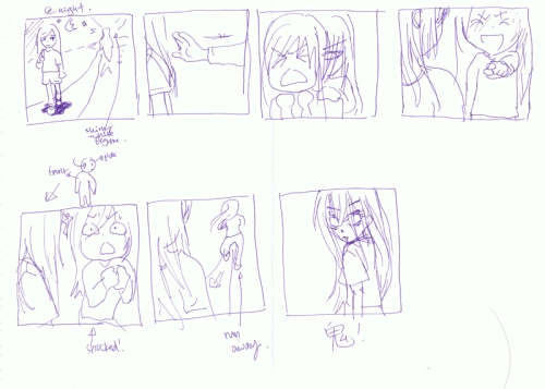
And here is my idea draft, just for your entertainment. I used this to “direct” my friends around. 😀
Class Exercise 3

This exercise allows us to explore what iconic and indexic representations of objects are like. We chose the OHP.

Iconic representations are like pictures, photos of the object itself, whilst indexic representations are things that suggest the object. In lecture, Ms Chiang showed as the indexic and iconic representations of a tree and fire. For the tree, the iconic representation is a photo of the tree itself, and the indexic representation was a picture of a leaf. For fire, the iconic representation is a picture of fire, whilst the indexic representation was smoke.

Kind of abstract, but I think that I kind of get it. Haha.

So for the OHP, the iconic rep is a drawing of the OHP itself.

And for indexic, we decided that the OHP head (see 2) is very representative of the entire OHP, and that maybe adding the screen in front (see 1) would make it even more obvious. Of course I also suggested that maybe just the screen itself (see 3) would be enough. But looks like we all agreed on pic 2 in the end, the OHP head plus screen in front.

I think the way that Alvina thinks is very different from the average student. It’s like her mind goes into places that normal people won’t. I think that’s a pretty cool thing.

I should learn to be like her. Think out of the box!